Python-Visualization

Python Visualization

Github Repo

Introduction

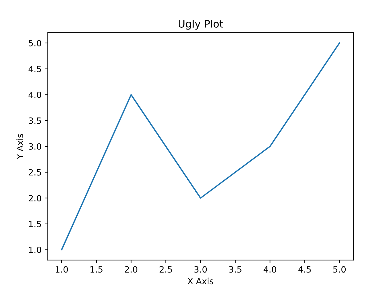
Visualization is of great importance in python! It’s very easy to learn several modules including matplotlib and seaborn, however, when you try to draw a picture in python without using the help of AI assistance, it may be like this:

1
2
3
4
5
6
7
8
9
10
11
12
13
14
15
16
17
18
19
20
21
22
23
24
25
26
27
28
29
30
'''
Author: Xiyuan Yang xiyuan_yang@outlook.com
Date: 2025-03-14 17:37:11
LastEditors: Xiyuan Yang xiyuan_yang@outlook.com
LastEditTime: 2025-03-14 17:37:16
FilePath: /visualzation/src/ugly_paint.py
Description:
Do you code and make progress today?
Copyright (c) 2025 by Xiyuan Yang, All Rights Reserved.
'''
import matplotlib as mlp
mlp.use("Agg")

import matplotlib.pyplot as plt

# Simple data
x = [1, 2, 3, 4, 5]
y = [1, 4, 2, 3, 5]

# Basic plot with default settings
plt.plot(x, y)

# Set title and labels with minimal styling
plt.title('Ugly Plot')
plt.xlabel('X Axis')
plt.ylabel('Y Axis')

# Display the plot
plt.savefig("figure/ugly plot.pdf")

You can make the pictures more advanced by adding several commands and customizations.

1
2
3
4
5
6
7
8
9
10
11
12
13
14
15
16
17
18
19
20
21
22
23
24
25
26
27
28
29
30
31
32
33
34
35
36
37
38
39
40
41
42
'''
Author: Xiyuan Yang xiyuan_yang@outlook.com
Date: 2025-03-14 14:53:43
LastEditors: Xiyuan Yang xiyuan_yang@outlook.com
LastEditTime: 2025-03-14 17:38:23
FilePath: /visualzation/src/advanced.py
Description:
Do you code and make progress today?
Copyright (c) 2025 by Xiyuan Yang, All Rights Reserved.
'''
import matplotlib as mlp
mlp.use("Agg")

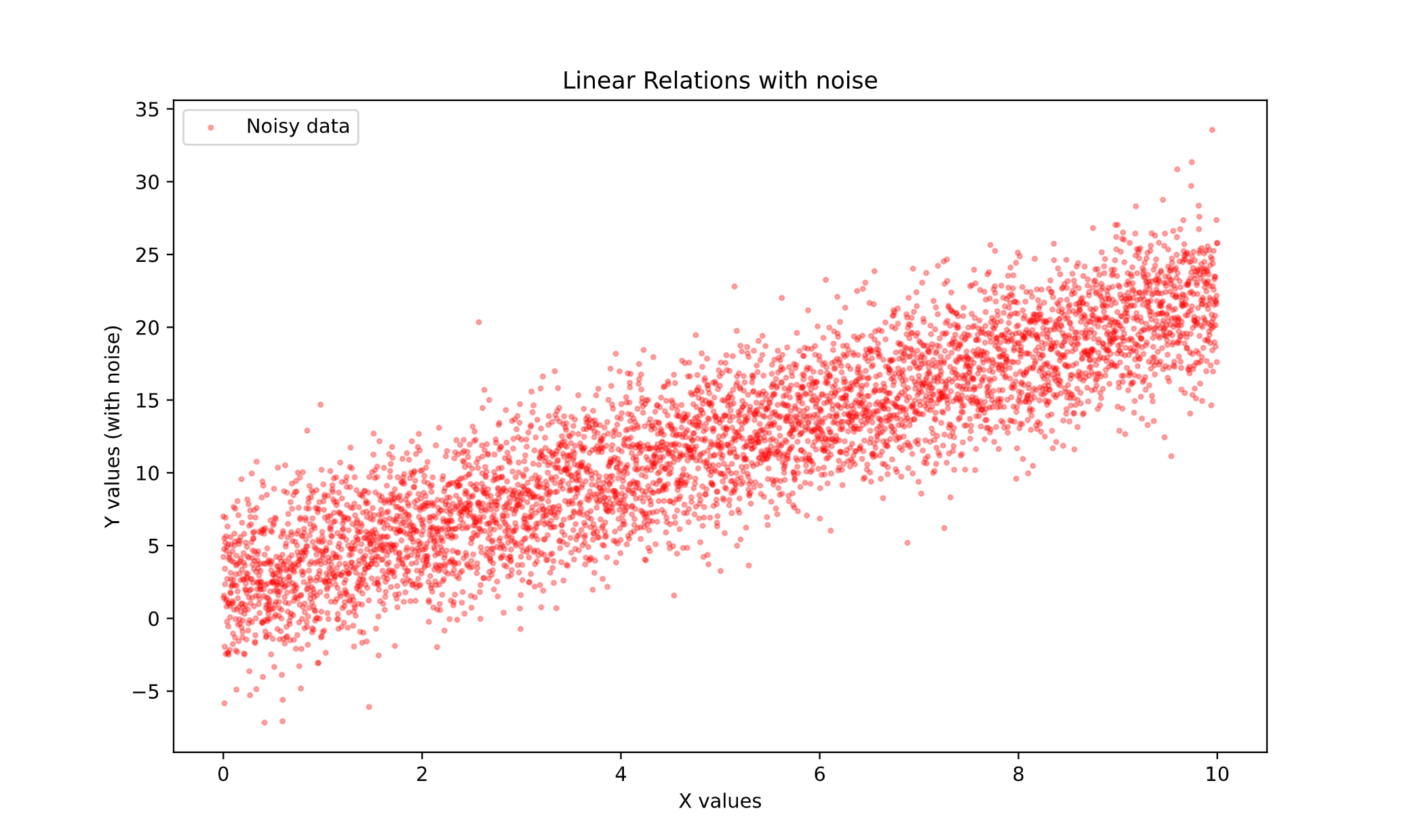
import matplotlib.pyplot as plt
import numpy as np
np.random.seed(2024)

# Generating data
X = np.linspace(0, 10 ,5000)

# Define the linear relation
# The relation: y = k * x + b
k = 2.0
b = 2.0

# Generating the true value of Y
Y_true = k * X + b

# Adding noise
noise = np.random.normal(0, 3, size=Y_true.shape)
Y_noise = Y_true + noise

# Plotting
plt.figure(figsize=(10, 6))
plt.scatter(x=X, y=Y_noise, color='red', label='Noisy data', alpha=0.3, s=5)
# plt.plot(X, Y_true, color='blue', label="Real Data", linewidth=3)
plt.title("Linear Relations with noise")
plt.xlabel("X values")
plt.ylabel("Y values (with noise)")
plt.legend()
plt.savefig("figure/Advanced.pdf")
plt.close()

Actually, this is what I can draw independently… Python gives users great freedom to customize their visualization, which at the same time increasing the learning cost for beginners. It’s unwise for Python beginners to learn how to draw a great picture by mastering all commands in matplotlib! It’s time-consuming and meaningless. Thus, I would like to introduce my drawing template in this blog, you can just clone and use it, saving lots of time for thinking more meaningful tasks!

Ugly Plot
Advanced Plot

Basic Principles

The basic principles:

  • Only introduce the 20% most basic yet most useful commands.
  • Giving

Templates

Preliminaries: Attention for Linux Users

In lack of QT platform in my WSL system, I have to make several modifications like this:

1
2
3
4
5
6
7
8
9
10
11
12
13
import matplotlib as mpl
mpl.use('Agg')
#...
#...
import matplotlib.plt as plt
# forbid scientific notation
np.set_printoptions(suppress=True)


# Then showing the figure by saving the figures.

plt.savefig("save/img.png")

Templates: fonts

The part below is cloned from my github repo.

In [ ]:

1
2
3
4
5
# Preliminaries
import numpy as np
import matplotlib.pyplot as plt
from scipy.stats import norm, entropy
from matplotlib.font_manager import FontProperties

Before setting font

In [ ]:

1
2
3
4
5
6
7
8
9
10
11
12
13
14
15
16
17
18
19
20
21
22
23
24
25
26
27
np.random.seed(2024)

# Generating data
X = np.linspace(0, 10 ,5000)

# Define the linear relation
# The relation: y = k * x + b
k = 2.0
b = 2.0

# Generating the true value of Y
Y_true = k * X + b

# Adding noise
noise = np.random.normal(0, 3, size=Y_true.shape)
Y_noise = Y_true + noise

# Plotting
plt.figure(figsize=(10, 6))
plt.scatter(x=X, y=Y_noise, color='red', label='Noisy data', alpha=0.3, s=5)
# plt.plot(X, Y_true, color='blue', label="Real Data", linewidth=3)
plt.title("Linear Relations with noise")
plt.xlabel("X values")
plt.ylabel("Y values (with noise)")
plt.legend()
plt.show()
plt.close()

How to set font

All the operations below are for Linux (or WSL) users, if you have Windows operating systems, I strongly recommend you to install WSL in your computer!

Firstly, use this command to check default type in your system.

In [ ]:

1
2
# Print the default font family
print(plt.rcParams['font.family'])

Secondly, you can use the command below to check all fonts available in your operating system.

In [ ]:

1
2
3
4
5
6
7
8
import matplotlib.font_manager as fm

# Find all system fonts
font_paths = fm.findSystemFonts(fontpaths=None)

# Print the list of available font paths
for font in font_paths:
print(font)

My output: [‘sans-serif’]

You can search all the fonts you like, but it’s time-consuming. In this tutorial, I only like to introduce two types of fonts that it’s most frequently used by myself: georgia (English) and songti (Chinese).

All the demonstrations are based on these two fonts.

In [ ]:

1
2
3
# Check whether the fonts available is included in the list:
!fc-list | grep -i "songti"
!fc-list | grep -i "georgia"

If you can see some outputs like the contents shown below (my contents):

1
2
3
4
5
6
7
8
9
/home/xiyuanyang/.local/share/fonts/songti.ttc: STSong:style=Regular,標準體,Ordinær,Normal,Normaali,Regolare,レギュラー,일반체,Regulier,Обычный,常规体
/home/xiyuanyang/.local/share/fonts/songti.ttc: Songti SC,宋體\-簡,宋体\-简:style=Regular,標準體,常规体
/home/xiyuanyang/.local/share/fonts/songti.ttc: Songti SC,宋體\-簡,宋体\-简:style=Black,黑體,黑体
/home/xiyuanyang/.local/share/fonts/songti.ttc: Songti TC,宋體\-繁,宋体\-繁:style=Regular,標準體,常规体
/home/xiyuanyang/.local/share/fonts/songti.ttc: Songti TC,宋體\-繁,宋体\-繁:style=Bold,粗體,粗体
/home/xiyuanyang/.local/share/fonts/songti.ttc: Songti SC,宋體\-簡,宋体\-简:style=Bold,粗體,粗体
/home/xiyuanyang/.local/share/fonts/songti.ttc: Songti TC,宋體\-繁,宋体\-繁:style=Light,細體,细体
/home/xiyuanyang/.local/share/fonts/songti.ttc: Songti SC,宋體\-簡,宋体\-简:style=Light,細體,细体
/home/xiyuanyang/.local/share/fonts/georgia.ttf: Georgia:style=Regular,Normal,obyčejné,Standard,Κανονικά,Normaali,Normál,Normale,Standaard,Normalny,Обычный,Normálne,Navadno,Arrunta

If you can see some files names songti.ttc and georgia.ttf, then means that you have installed these fonts successfully!

Not successfully? (Skip optinally)

Then you need to install fonts munually. You can google it for getting fonts packages like songti.ttc.

In [ ]:

1
2
3
4
5
6
7
8
9
10
!cd ~/.local/share/

# create directory to store fonts
!mkdir fonts

# Remember to change to your own locations!
!mv ~/songti.ttc .

# Update cache
!fc-cache -fv

After operating these commands, check by using fc-list command again. If you can see the target font, just skip to the next part!

Installed successfully

Add these three commands in your python scripts, and you can then use the font freely in your python scripts!

In [ ]:

1
2
3
plt.rcParams['font.family'] = 'Serif'
plt.rcParams['font.size'] = 12
font = FontProperties(fname="/home/xiyuanyang/.local/share/fonts/songti.ttc")

After setting font

In [ ]:

1
2
3
4
5
6
7
8
9
10
11
12
13
14
15
16
17
18
19
20
21
22
23
24
25
26
27
28
29
30
31
plt.rcParams['font.family'] = 'Serif'
plt.rcParams['font.size'] = 12
font = FontProperties(fname="/home/xiyuanyang/.local/share/fonts/georgia.ttf")
# Example
np.random.seed(2024)

# Generating data
X = np.linspace(0, 10 ,5000)

# Define the linear relation
# The relation: y = k * x + b
k = 2.0
b = 2.0

# Generating the true value of Y
Y_true = k * X + b

# Adding noise
noise = np.random.normal(0, 3, size=Y_true.shape)
Y_noise = Y_true + noise

# Plotting
plt.figure(figsize=(10, 6))
plt.scatter(x=X, y=Y_noise, color='red', label='Noisy data', alpha=0.3, s=5)
# plt.plot(X, Y_true, color='blue', label="Real Data", linewidth=3)
plt.title("Linear Relations with noise")
plt.xlabel("X values")
plt.ylabel("Y values (with noise)")
plt.legend()
plt.show()
plt.close()

Getting into the functions

In [ ]:

1
2
3
4
5
6
7
8
9
10
11
12
13
14
15
16
17
18
19
20
21
22
23
24
25
26
27
28
29
def draw_scatter(X=[1,2,3,4], y=[10,20,-10,50], fontsize=12, filepath="figure/my images.png",
title="My title", lable="my label", x_lable="Xlable", y_lable="Ylabel",
):
# import modules

# Modifying the backend of matplotlib
import matplotlib as mlp
mlp.use("Agg")

import matplotlib.pyplot as plt
import numpy as np
from matplotlib.font_manager import FontProperties

plt.rcParams['font.family'] = 'Serif'
plt.rcParams['font.size'] = fontsize
font_geogria = FontProperties(fname="/home/xiyuanyang/.local/share/fonts/georgia.ttf")
font_sonti = FontProperties(fname="/home/xiyuanyang/.local/share/fonts/songti.ttc")

# Plotting
plt.figure(figsize=(10, 6))
plt.scatter(x=X, y=y, color='red', label=lable, alpha=0.3, s=5)
plt.title(title, fontproperties = font_geogria, fontsize = 18)
plt.xlabel(x_lable)
plt.ylabel(y_lable)
plt.legend()

# ! Attention, suggest you to use the absolute path.
plt.savefig(filepath)
plt.close()

Python-Visualization
https://xiyuanyang-code.github.io/posts/Python-visualization/
Author
Xiyuan Yang
Posted on
March 14, 2025
Updated on
March 16, 2025
Licensed under